Visualizing Differentially Expressed Genes: Volcano Plot and CPM Scatter Plot
Visual representation of differential expression analysis results is crucial for interpreting and communicating findings in RNA-seq experiments. Two common and highly informative plots used in this context are the volcano plot and the CPM (Counts Per Million) scatter plot. These visualizations provide intuitive insights into the data, highlighting genes that are significantly differentially expressed and their expression levels across conditions. This protocol was developed using a system equipped with an Intel 10th generation i9-10910 processor and 48GB of memory. The test environment includes R version 4.4.0 running on macOS 14.4.1.
Volcano Plot
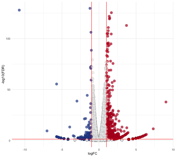
A volcano plot combines statistical significance with the magnitude of change (fold change) in a single plot, making it a powerful tool for identifying DEGs. It plots the negative log10 adjust p-value or false discovery rate (FDR) against the log2 fold change, allowing for easy identification of genes that are both statistically significant and biologically meaningful.
Required Packages:
library(ggplot2)
library(ggrepel)
library(egg)
Step-by-Step Guide
1. Load Your DEG Data as Base Type
- Load the DEG data from a CSV (can be used a txt file) file into a data frame. Ensure that the first row contains headers and the first column contains row names.
Ctr <- read.csv("Volcano.csv", head = T, row.names = 1) - The DEG data can be utilized directly for analysis. In this instance, ROS marker genes are identified (
ROS.hallmark) and labeled (ROS) separately. Example of the first few rows of the data:> head(Ctr) SYMBOL logFC logCPM PValue FDR ROS.hallmark ENSG00000204472 AIF1 9.025174 1.58214476 2.34e-40 1.62e-38 ENSG00000142168 SOD1 7.315282 -0.07862934 3.15e-13 3.49e-12 ROS ENSG00000268651 CTAG1A 6.390608 0.43013880 1.64e-07 1.06e-06 ENSG00000170417 TMEM182 6.254823 0.32867916 6.20e-07 3.72e-06 ENSG00000214960 CRPPA 6.254823 0.37677955 6.20e-07 3.72e-06 ENSG00000164675 IQUB 6.104918 -0.43713437 2.35e-06 1.32e-05
2. Draw a Basal Plot
- Use ggplot2 to create the basl Volcano plot:
ggplot(data = Ctr, aes(x = logFC, y = FDR)) + geom_point()
3. Adjust the y-axis to Display in Negative log10 FDR Format and Add Guide Lines
- Update the plot to transform the y-axis and add guide lines:
p <- ggplot(data = Ctr, aes(x = logFC, y = -log10(FDR))) + geom_point() + theme_minimal()
p2 <- p + geom_vline(xintercept=c(-1, 1), col = "red") + geom_hline(yintercept = -log10(0.05), col = "red")
4. Seperate the Section of Significance by Appying FC and FDR
Update the plot to distinguish the section of significant DEGs by appying FC and FDR:
# Filter data
Ctr$diffexpressed <- "NO"
Ctr$diffexpressed[Ctr$logFC > 1 & Ctr$PValue < 0.05] <- "UP"
Ctr$diffexpressed[Ctr$logFC < -1 & Ctr$PValue < 0.05] <- "DOWN"

# Plotting
p <- ggplot(data = Ctr, aes(x = logFC, y = -log10(FDR))) +
  geom_point(aes(color = diffexpressed),
            size = 4,
            shape = 21,
            fill = c("#294A99", "#ECECEC", "#BE1826")[factor(Ctr$diffexpressed)],
            alpha = 0.7,
            stroke = 0.1) +
  scale_color_manual(values = c("DOWN" = "black", "UP" = "black", "NO" = "black")) +
  theme_minimal() +
  theme(legend.position = "none") +
  geom_vline(xintercept = c(-1, 1), col = "red") +
  geom_hline(yintercept = -log10(0.05), col = "red")
In these codes, you can adjust the size (
size), shape (shape), transparency (alpha), and stroke (stroke) of the points to fit your preferences. Thefillparameter allows you to specify colors for"DOWN","NO", and"UP"states usinghexcodes. Refer to the ggplot2 documentation for more detailed information.Output:

5. Represent Gene Names that Satisfy Specific Conditions Using ggrepel
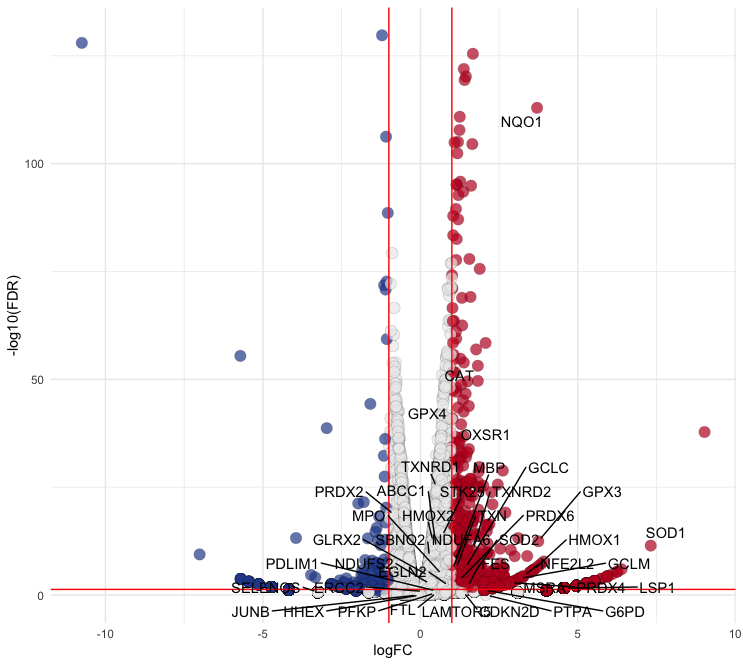
In this case, I found ROS-related genes in papers and databases and labeled them as
ROSin theROS.hallmarkcolumn. Replace the values in this column with the corresponding values in theSYMBOLcolumn for plotting:p2 <- p + geom_text_repel( data = subset(Ctr, ROS.hallmark == "ROS"), aes(label = SYMBOL), box.padding = 0.35, point.padding = 0.3, max.overlaps = Inf, segment.color = 'black' )- To display only genes that meet specific criteria (e.g. DEGs), filter the data accordingly:
# Filter data filtered_data <- subset(Ctr, ROS.hallmark == "ROS" & (logFC >= 1 | logFC <= -1) & FDR < 0.05) # Plotting p2 <- p + geom_text_repel( data = filtered_data, aes(label = SYMBOL), box.padding = 0.35, point.padding = 0.3, max.overlaps = Inf, segment.color = 'black' ) - Output:

Summarize
Ctr <- read.csv("Volcano.csv", head = T, row.names = 1)
filtered_data <- subset(Ctr, ROS.hallmark == "ROS" & (logFC >= 1 | logFC <= -1) & FDR < 0.05)
p <- ggplot(data = Ctr, aes(x = logFC, y = -log10(FDR))) +
  geom_point(aes(color = diffexpressed), size = 4, shape = 21,
             fill = c("#294A99", "#ECECEC", "#BE1826")[factor(Ctr$diffexpressed)],
             alpha = 0.7, stroke = 0.1) +
  scale_color_manual(values = c("DOWN" = "black", "UP" = "black", "NO" = "black")) +
  theme_minimal() +
  theme(legend.position = "none",
        panel.border = element_rect(color = "black", fill = NA, size = 1)) +
  geom_vline(xintercept = c(-1, 1), col = "red") +
  geom_hline(yintercept = -log10(0.05), col = "red") +
  geom_text_repel(
    data = filtered_data,
    aes(label = SYMBOL),
    box.padding = 0.35,
    point.padding = 0.3,
    max.overlaps = Inf,
    segment.color = 'black',
    size = 3
  )

# Adjust plot size for publication
p2 <- set_panel_size(p, width = unit(49, "mm"), height = unit(49, "mm"))
grid.arrange(p2)
CPM Scatter Plot
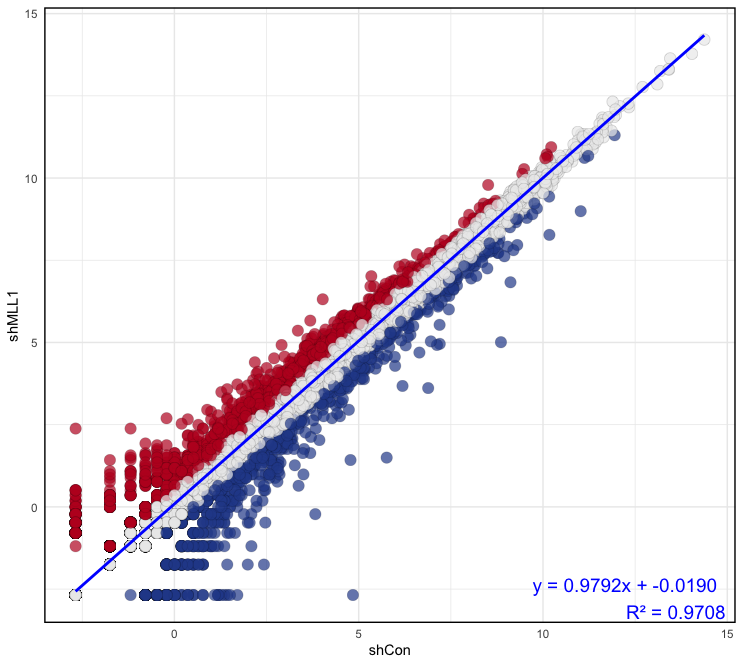
The CPM scatter plot is used to visualize the normalized expression levels of genes between two conditions. By plotting the log-transformed CPM values of one condition against another, this scatter plot highlights the overall distribution and correlation of gene expression levels, helping to identify outliers and trends.
Step-by-Step Guide
1. Load Your CPM Data as Base Type
- Load the CPM data from a CSV file into a data frame. Ensure that the first row contains headers and the first column contains row names:
Ctr <- read.csv("Scatter_CPM.csv", head = T, row.names = 1) - Example of the first few rows of the data:
> head(Ctr)
                    shCon    shMLL1    shNRF2     shUTX
ENSG00000000003 -2.680285 -2.680285 -2.680285 -1.549635
ENSG00000000005  4.307581  4.677028  4.580042  4.872485
ENSG00000000419 -1.749770 -1.753980 -1.171245 -1.549635
ENSG00000000460  5.275807  5.093826  5.081307  4.986667
ENSG00000000938  3.287921  3.437214  4.075670  3.266172
ENSG00000000971  5.988133  4.288445  5.394514  4.854088
2. Caculate Correlation Coefficiency Between Samples
- Calculate the linear model to assess the relationship between two samples. This can help determine how similar the expression levels are between two conditions:
# Fit a lineat model model <- lm(formula = shCon ~ shMLL1, data = Ctr) # Summarize the model to get the correlation coefficient model_summary <- summary(model) # Extract coefficiency intercept <- model$coefficients[1] slope <- model$coefficients[2] r_squared <- model_summary$r.squared - Output:
> model <- lm(formula = shCon ~ shMLL1, data = Ctr)
> model
Call:
lm(formula = shCon ~ shMLL1, data = Ctr)

Coefficients:
(Intercept)       shMLL1
  -0.01902      0.97918
> model_summary <- summary(model) > model_summary Call: lm(formula = shCon ~ shMLL1, data = Ctr) Residuals: Min 1Q Median 3Q Max -4.9938 -0.2207 -0.0368 0.2283 7.4868 Coefficients: Estimate Std. Error t value Pr(>|t|) (Intercept) -0.019021 0.007697 -2.471 0.0135 * shMLL1 0.979179 0.001696 577.328 <2e-16 *** --- Signif. codes: 0 ‘***’ 0.001 ‘**’ 0.01 ‘*’ 0.05 ‘.’ 0.1 ‘ ’ 1 Residual standard error: 0.6539 on 10026 degrees of freedom Multiple R-squared: 0.9708, Adjusted R-squared: 0.9708 F-statistic: 3.333e+05 on 1 and 10026 DF, p-value: < 2.2e-16
3. Make a scatter plot
- In this section, you will create a scatter plot to visualize the relationship between two conditions (
shConandshMLL1) and classify genes based on their expression changes:# Calculate difference between samples classify <- (Ctr$shMLL1) - (Ctr$shCon) # Classify genes Ctr$diffexpressed <- "NO" Ctr$diffexpressed[classify > 0.5] <- "UP" Ctr$diffexpressed[classify < (-0.5)] <- "DOWN" # Depict a plot with the linear model p <- ggplot(data = Ctr, aes(x = shCon, y = shMLL1)) + geom_point(aes(color = diffexpressed), size = 4, shape = 21, fill = c("#294A99", "#ECECEC", "#BE1826")[factor(Ctr$diffexpressed)], alpha = 0.7, stroke = 0.1) + scale_color_manual(values = c("DOWN" = "black", "UP" = "black", "NO" = "black")) + theme_minimal() + theme(legend.position = "none", panel.border = element_rect(color = "black", fill = NA, size = 1)) + geom_smooth(method = "lm", se = FALSE, color = "blue") + annotate("text", x = Inf, y = -Inf, label = sprintf("y = %.4fx + %.4f\nR² = %.4f", slope, intercept, r_squared), hjust = 1.1, vjust = -0.1, size = 5, color = "blue") - Output:

Summarize
Ctr <- read.csv("Scatter_CPM.csv", head = T, row.names = 1)
model <- lm(formula = shCon ~ shMLL1, data = Ctr)
model_summary <- summary(model)
intercept <- model$coefficients[1]
slope <- model$coefficients[2]
r_squared <- model_summary$r.squared

p <- ggplot(data = Ctr, aes(x = shCon, y = shMLL1)) +
  geom_point(aes(color = diffexpressed), size = 4, shape = 21,
            fill = c("#294A99", "#ECECEC", "#BE1826")[factor(Ctr$diffexpressed)],
            alpha = 0.7, stroke = 0.1) +
  scale_color_manual(values = c("DOWN" = "black", "UP" = "black", "NO" = "black")) +
  theme_minimal() +
  theme(legend.position = "none",
        panel.border = element_rect(color = "black", fill = NA, size = 1)) +
  geom_smooth(method = "lm", se = FALSE, color = "blue") +
  annotate("text", x = Inf, y = -Inf, label = sprintf("y = %.4fx + %.4f\nR² = %.4f", slope, intercept, r_squared),
          hjust = 1.1, vjust = -0.1, size = 5, color = "blue")

# Adjust plot size for publication
p2 <- set_panel_size(p, width = unit(49, "mm"), height = unit(49, "mm"))
grid.arrange(p2)

