Essential Tools for Heatmap Visualization in Sequencing Data: pheatmap and ComplexHeatmap
In the analysis of sequencing data, drawing heatmaps is crucial for visualizing complex information in a comprehensible manner, allowing researchers to detect patterns, correlations, and outliers within large datasets. Heatmaps represent matrix data where individual values contained in a matrix are represented as colors, facilitating the quick absorption of insights about the underlying biological processes. Among the tools available for this purpose in R, the pheatmap and ComplexHeatmap packages are particularly noteworthy. The pheatmap package provides a simple and highly customizable interface for generating heatmaps, offering features such as clustering, annotation, and adjustments to color scales. On the other hand, ComplexHeatmap extends these functionalities by enabling the integration of multiple heatmaps, adding complex annotations, and supporting the arrangement of heatmaps and other graphical elements in a highly flexible manner. This protocol was developed using a system equipped with an Intel 10th generation i9-10910 processor and 48GB of memory. The test environment includes R version 4.4.0 running on macOS 14.4.1.
pheatmap versus ComplexHeatmap
The packages pheatmap and complexheatmap are both apt for the generation of heatmaps, albeit with distinct differences. Refer to the following table, which outlines the respective advantages and disadvantages of each package, and select the corresponding manuals for further guidance. Additionally, unlike other plotting tutorials (Volcano, scatter, correlation, and buble chart), this guide incorporates complex parameters and fundamental logical functions of R, necessitating a foundational understanding of the R programming language. Specifically, the complexheatmap package is designed for users with an intermediate level of expertise.
| Aspect | pheatmap | ComplexHeatmap |
|---|---|---|
| Ease of Use | More effective for beginners and quick implementations | Less straightforward initially, better for experienced users |
| Customization and Flexibility | Limited in customization, suitable for basic heatmaps | Highly customizable, ideal for detailed visualizations |
| Integration with Other Data Types and Visuals | Less effective for complex data integration | Highly effective for integrating multiple data types and visuals |
| Performance and Scalability | Good for smaller datasets and simpler analyses | Superior for large datasets and complex analyses |
pheatmap
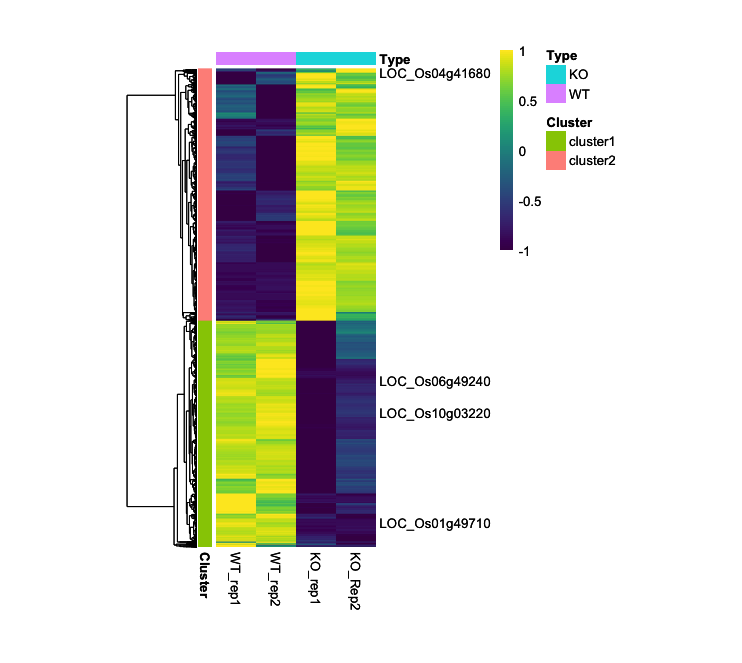
In this section, the user is introduced to the techniques for visualizing basic RNA-seq data through heatmaps, using the pheatmap package. The dataset featured originates from CPM values, which were collected following RNA-seq assays on duplicate samples of both wild-type rice and genetically modified rice with certain genes knockouted. Please be advised that the pheatmap package supports only fundamental heatmap visualization. For an in-depth examination of advanced features, one is directed to consult the section dedicated to the complexheatmap package, which follows.
Required Packages:
library(pheatmap)
library(RColorBrewer)
library(viridis)
library(viridisLite)
Step-by-Step pheatmap Guide
1. Load CPM Data and Prepare Data Frame
Load your data. In this guide, I will load CPM data without using row.names = 1, but this is optional:
data <- read.csv("heatmap.csv", header = T)
- This dataset is organized as follows:
> head(data)
            MSU  WT_rep1  WT_rep2    KO_rep1    KO_Rep2  Cluster
1 LOC_Os02g57000 6.475709 6.216468 -3.0875734 -3.3857658 cluster1
2 LOC_Os02g33740 5.597263 5.432519 -2.3418637 -3.0058172 cluster1
3 LOC_Os03g59300 6.656864 6.558811  0.3320713  0.3533387 cluster1
4 LOC_Os01g21580 4.679595 4.487096 -2.7940856 -2.7053595 cluster1
5 LOC_Os02g03640 4.724022 4.939755 -2.1597539 -1.8963395 cluster1
6 LOC_Os09g29050 5.663938 5.379374 -0.4579156 -0.2427508 cluster1
Select the values in the data that will be analyzed and specify their row names as gene numbers (
data$MSU):rownames(data) <- data$MSU expression_data <- data[, 2:5] - The data frame of
expression_datais organized as follows:> head(expression_data) WT_rep1 WT_rep2 KO_rep1 KO_Rep2 LOC_Os02g57000 6.475709 6.216468 -3.0875734 -3.3857658 LOC_Os02g33740 5.597263 5.432519 -2.3418637 -3.0058172 LOC_Os03g59300 6.656864 6.558811 0.3320713 0.3533387 LOC_Os01g21580 4.679595 4.487096 -2.7940856 -2.7053595 LOC_Os02g03640 4.724022 4.939755 -2.1597539 -1.8963395 LOC_Os09g29050 5.663938 5.379374 -0.4579156 -0.2427508
2. Create Annotation Frames for Rows and Columns
The rows of the dataset are divided by the Cluster of data and the columns are divided by the head of the data to create the annotation:
# For row
annotation <- data.frame(Cluster = factor(data$Cluster))
rownames(annotation) <- rownames(data)

#For column
annotation_col <- data.frame(Type = factor(c("WT", "WT", "KO", "KO")))
rownames(annotation_col) <- colnames(expression_data)
- The structure of the
annotationandannotation_coldata frames is shown below:> head(annotation) Cluster LOC_Os02g57000 cluster1 LOC_Os02g33740 cluster1 LOC_Os03g59300 cluster1 LOC_Os01g21580 cluster1 LOC_Os02g03640 cluster1 LOC_Os09g29050 cluster1 > annotation_col Type WT_rep1 WT WT_rep2 WT KO_rep1 KO KO_Rep2 KO
3. Prepare Color Palette for the Heatmap
Choose a color scheme for your heatmap visualization. This can be done by specifying either the name or hex codes of colors:
myCol <- colorRampPalette(c('dodgerblue', 'black', 'yellow'))(100)
- The number
100represents the granularity of the heatmap, affecting the differentiation between data points. More colors provide finer distinctions, helpful for detailed data visualization, whereas fewer colors might emphasize broader trends.
If you need a broader range of color palettes, the RColorBrewer package offers a variety of user-favorite choices:
myCol <- colorRampPalette(brewer.pal(11, "RdYlBu"))(100)
myCol_reverse <- colorRampPalette(rev(brewer.pal(11, "RdYlBu")))(100)
- In these codes,
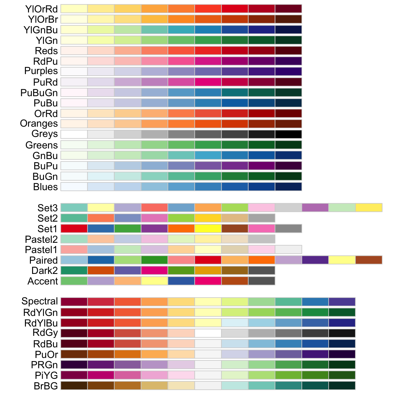
"RdYlBu"indicates a specific color palette, the number11specifically refers to the number of different colors that you want to extract from the “RdYlBu” palette provided by the RColorBrewer package. The number of100means the granularity in the heatmap. Therevargument is used to reverse the color order. The available color codes and numbers are shown below image.
The viridis package is also a good one that provides a palette for color selection.
myCol <- viridis::viridis(100, option = "magma")
myCol_magma_rev <- viridis::viridis(100, option = "magma", direction = -1)
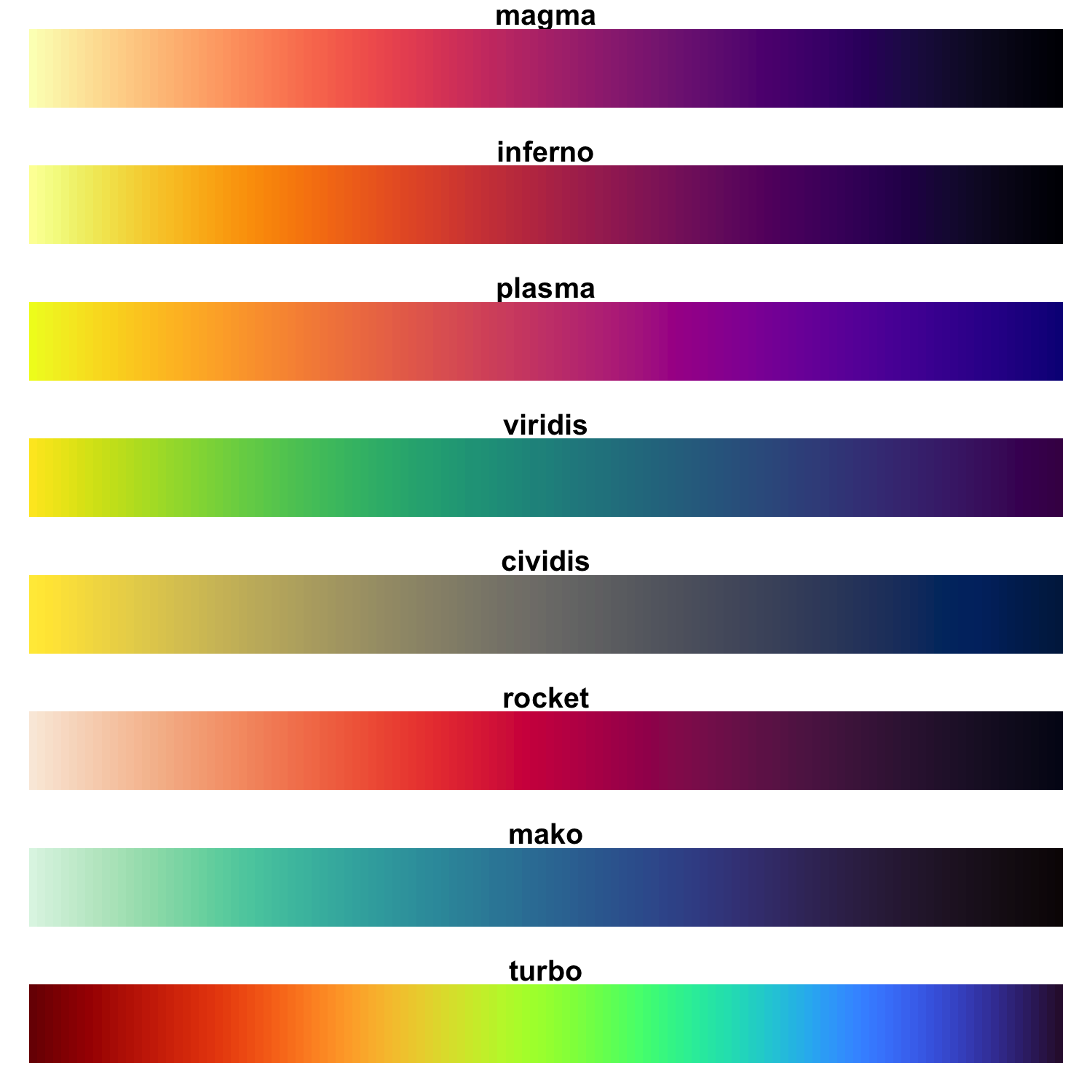
The following images display the available color palettes from Viridis:
4. Plotting
myCol <- viridis::viridis(100, option = "viridis")
pheatmap_result <- pheatmap(expression_data,
         annotation_row = annotation,
         annotation_col = annotation_col,
         cluster_rows = TRUE, cluster_cols = FALSE,
         show_rownames = FALSE, show_colnames = TRUE,
         scale = "row",
         color = myCol,
         clustering_distance_rows = "euclidean",
         clustering_method = "average",
         cellheight = 0.06, cellwidth = 30)
Important: Typically, heatmap data is normalized and presented as a z-score to ensure comparability across data points. In the provided example, normalization is achieved by computing a z-score with the scale = "row" option directly in the heatmap function, thus eliminating the need for using the t(scale(t())) function.
- These codes utilize
Euclideandistance for clustering and employs theaveragealgorithm. - To modify the clustering distance, add the
clustering_distance_rows = "<distance>"parameter. Availabledistancemetrics includeeuclidean,maximum,manhattan,canberra, andbinary. Additionally, to change the clustering algorithm, adjust the
clustering_method = "<algorithm>"parameter. Possible algorithms aresingle(minimum linkage),complete(maximum linkage),average(UPGMA),ward.D(Ward’s minimum variance method),ward.D2(Modified Ward’s method),mcquitty(McQuitty’s method, WPGMA),median(Median linkage, WPGMC), andcentroid(Centroid linkage, UPGMC).- If you want to adjust the range of the heatmap, you can do so using the
breaksargument:my_breaks <- seq(-1, 1, length.out = length(myCol) + 1) # Set the breaks pheatmap_result_Rev <- pheatmap(expression_data, annotation_row = annotation, annotation_col = annotation_col, cluster_rows = TRUE, cluster_cols = FALSE, show_rownames = FALSE, show_colnames = TRUE, scale = "row", color = myCol, breaks = my_breaks, clustering_distance_rows = "euclidean", clustering_method = "average", cellheight = 0.06, cellwidth = 30) - You can also output a list of genes in clustering order:
clustered_gene_order <- rownames(expression_data)[pheatmap_result$tree_row$order]
clustered_genes_with_clusters <- data.frame(
  Gene = clustered_gene_order,
  OriginalCluster = annotation[clustered_gene_order, "Cluster"]
)
# Save the list as a csv format
write.csv(clustered_genes_with_clusters, file = "clustered_genes_with_clusters.csv", row.names = FALSE, quote = FALSE)
5. (Optional) Represent Specific Gene Symbols in the Heatmap
Although this functionality is not fully implemented in the current setup, it is recommended to use the ComplexHeatmap package for a robust implementation of this featur
# Specify the genes whose names you want to be displayed
selected_genes <- c("LOC_Os06g49240", "LOC_Os01g49710", "LOC_Os10g03220", "LOC_Os04g41680")
labels_row <- ifelse(rownames(expression_data) %in% selected_genes, rownames(expression_data), "")

# Plotting
pheatmap_result_Name <- pheatmap(expression_data,
         annotation_row = annotation,
         annotation_col = annotation_col,
         cluster_rows = TRUE, cluster_cols = FALSE,
         show_rownames = TRUE, show_colnames = TRUE,
         labels_row = labels_row,
         scale = "row",
         color = myCol,
         breaks = my_breaks,
         clustering_distance_rows = "euclidean",
         clustering_method = "average",
         cellheight = 0.06, cellwidth = 30)
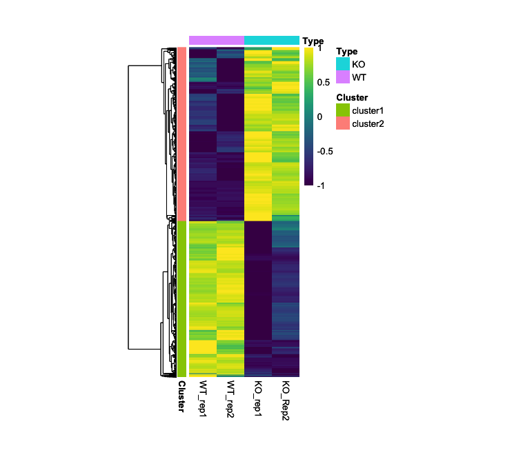
- Output (Left; Step 4, Right; Step 5): (Clicking on the image will open it in a larger view.)
CompexHeatmap
In this section, the complexheatmap package will be elucidated through the analysis of three distinct case studies. Initially, data from a heatmap generated using the ‘pheatmap’ package will be implemented employing the ‘complexheatmap’ package. Subsequently, the integration of RNA-seq and ChIP-seq data will be demonstrated, utilizing the data integration parameters that constitute a principal feature of this package. Lastly, the process for integrating various RNA-seq datasets will be discussed.
Required Packages:
library(ComplexHeatmap)
library(circlize)
library(grid)
library(RColorBrewer)
library(viridis)
library(viridisLite)
- If you do not possess specialized knowledge, the use of the
ht_optfunction in the Complexheatmap may not be advisable. It is important to note that this function’s settings depend permanently on the previously saved value, even after re-invoking the library. If a reset is necessary, please utilize the command provided below.ht_opt(Reset = TRUE) print(ht_opt) # Check
Step-by-Step Guide: Case I - RNA-seq Heatmap
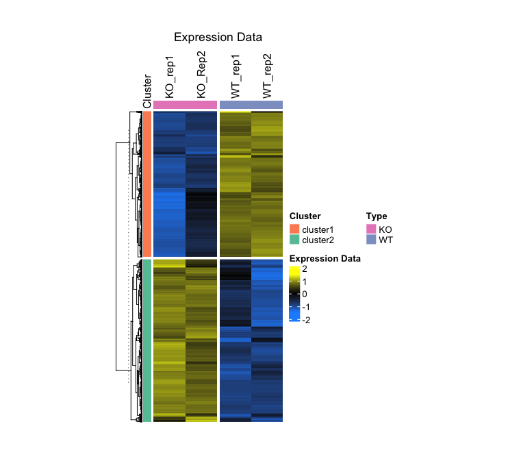
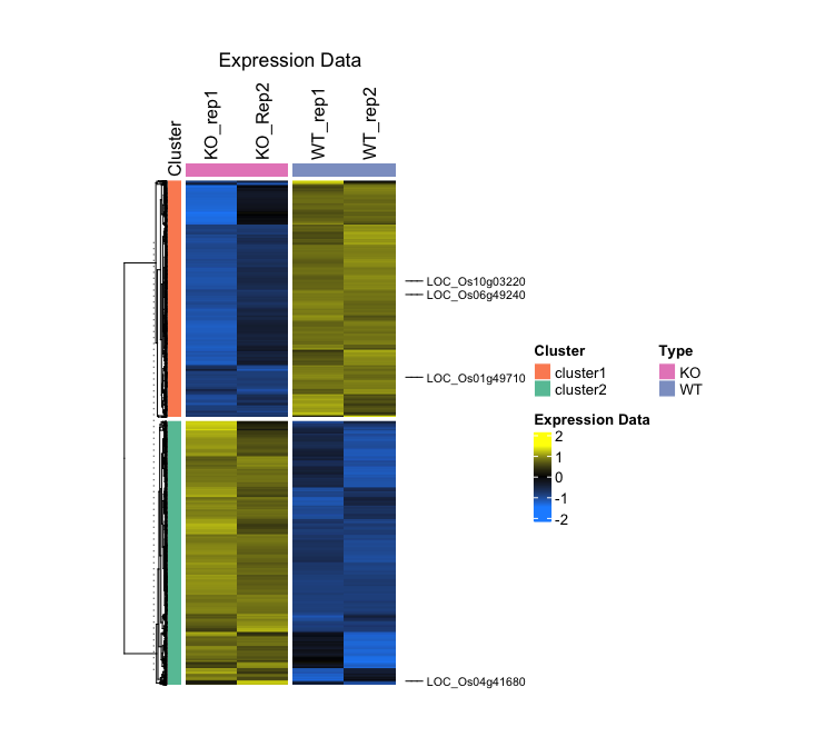
In this case, I will visualize the CPM values of wild-type rice and rice with a specific gene has been knocked out, through the application of biological replicates. The data were subjected to DEG analysis using edgeR. Additionally, I have generated a Cluster row labeled cluster1 for genes that are upregulated and cluster2 for genes that are downregulated.
1. Load Data and Normalize with z-score
# Load data without the 'row.names' option
data <- read.csv("heatmap.csv", header = T)

# Specify the range of the data to be analyzed
expression_data <- as.matrix(data[, 2:5])

# Normalize to z-score
z_score <- t(scale(t(expression_data)))
z_min <- min(z_score)
z_max <- max(z_score)
rownames(z_score) <- data$MSU
- Output:
> head(data)
            MSU  WT_rep1  WT_rep2    KO_rep1    KO_Rep2  Cluster
1 LOC_Os02g57000 6.475709 6.216468 -3.0875734 -3.3857658 cluster1
2 LOC_Os02g33740 5.597263 5.432519 -2.3418637 -3.0058172 cluster1
3 LOC_Os03g59300 6.656864 6.558811  0.3320713  0.3533387 cluster1
4 LOC_Os01g21580 4.679595 4.487096 -2.7940856 -2.7053595 cluster1
5 LOC_Os02g03640 4.724022 4.939755 -2.1597539 -1.8963395 cluster1
6 LOC_Os09g29050 5.663938 5.379374 -0.4579156 -0.2427508 cluster1

> head(z_score)
                WT_rep1   WT_rep2    KO_rep1    KO_Rep2
LOC_Os02g57000 0.8890761 0.8422390 -0.8387204 -0.8925947
LOC_Os02g33740 0.8819111 0.8471257 -0.7944220 -0.9346147
LOC_Os03g59300 0.8795228 0.8524170 -0.8689095 -0.8630303
LOC_Os01g21580 0.8885737 0.8431155 -0.8763208 -0.8553683
LOC_Os02g03640 0.8382743 0.8927108 -0.8987265 -0.8322585
LOC_Os09g29050 0.9071574 0.8232973 -0.8969315 -0.8335232
2. Prepare Cluster Annotations
# Create a factor for the cluster data and setup the annotation dataframe
cluster_factor <- factor(data$Cluster)
annotation <- data.frame(Cluster = cluster_factor)
rownames(annotation) <- data$MSU

# Define a color palette
set2_palette <- brewer.pal(8, "Set2")

# Create row annotations
row_anno <- rowAnnotation(
  df = annotation,
  col = list(Cluster = setNames(c(set2_palette[2], set2_palette[1]), levels(cluster_factor))),
  annotation_name_side = "top",
  simple_anno_size = unit(3, "mm")
)

# Create column annotations
col_anno <- HeatmapAnnotation(
  Type = factor(c("WT", "WT", "KO", "KO")),
  col = list(Type = c(WT = set2_palette[3], KO = set2_palette[4])),
  show_annotation_name = FALSE,
  simple_anno_size = unit(3, "mm")
)
- Output:
> row_anno
A HeatmapAnnotation object with 1 annotation
  name: heatmap_annotation_0
  position: row
  items: 5981
  width: 3mm
  height: 1npc
  this object is subsettable
  14.4069666666667mm extension on the top

    name annotation_type color_mapping width
Cluster discrete vector  user-defined   3mm
> col_anno
A HeatmapAnnotation object with 1 annotation
  name: heatmap_annotation_1
  position: column
  items: 4
  width: 1npc
  height: 3mm
  this object is subsettable

name annotation_type color_mapping height
Type discrete vector  user-defined    3mm
3. Plotting
main_heatmap <- Heatmap(
  z_score,
  name = "Expression Data",
  col = colorRamp2(c(z_min, 0, z_max), c('dodgerblue', 'black', 'yellow')),
  show_row_names = FALSE,
  show_column_names = TRUE,
  column_title = "Expression Data",
  clustering_method_rows = "average",
  cluster_columns = FALSE,
  column_names_side = "top",
  column_split = factor(c("WT", "WT", "KO", "KO")),
  top_annotation = col_anno,
  split = cluster_factor,
  row_title = NULL,
  left_annotation = row_anno,
  width = unit(5, "cm"),
  height = unit(12, "cm")
)

draw(main_heatmap)
- These codes utilize
Euclideandistance for clustering and employs thecompletealgorithm (Default). - To modify the clustering distance, add the
clustering_distance_rows = "<distance>"parameter. Availabledistancemetrics includeeuclidean,maximum,manhattan,canberra, andbinary. - Additionally, to change the clustering algorithm, adjust the
clustering_method_rows = "<algorithm>"parameter. Possible algorithms aresingle(minimum linkage),complete(maximum linkage),average(UPGMA),ward.D(Ward’s minimum variance method),ward.D2(Modified Ward’s method),mcquitty(McQuitty’s method, WPGMA),median(Median linkage, WPGMC), andcentroid(Centroid linkage, UPGMC).
4. (Optional) Represent specific gene symbols in the heatmap
# Specify the genes whose names you want to be displayed
selected_genes <- c("LOC_Os06g49240", "LOC_Os01g49710", "LOC_Os10g03220", "LOC_Os04g41680")
row_indices <- which(data$MSU %in% selected_genes)

# Plotting
main_heatmap2 <- main_heatmap + rowAnnotation(
  foo = anno_mark(
    at = row_indices,
    labels = data$MSU[row_indices],
    which = "row",
    labels_gp = gpar(fontsize = 8))
)

# Save
draw(main_heatmap2, merge_legends = TRUE, gap = unit(0, "mm"))
- Output (Left; Step 3, Right; Step 4): (Clicking on the image will open it in a larger view.)
Step-by-Step Guide: Case II - Integration of RNA-seq with Simpler Structured Dataset
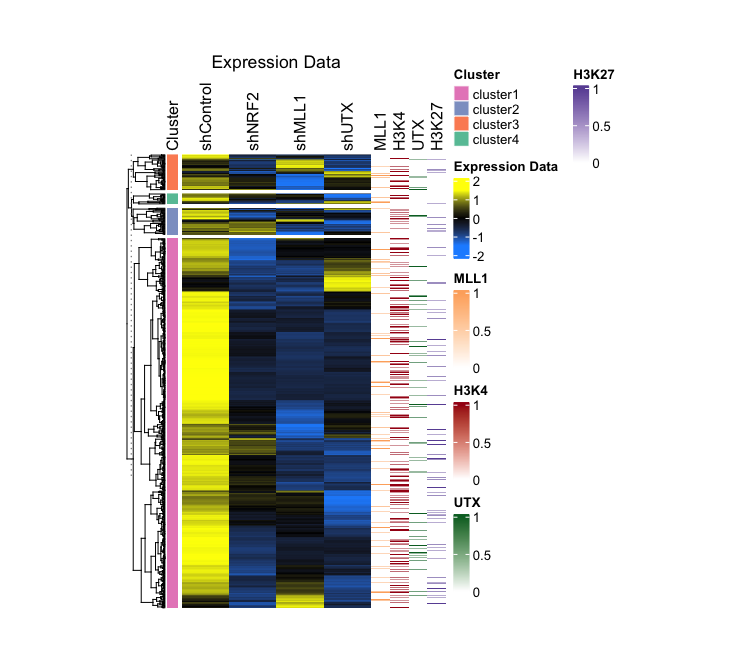
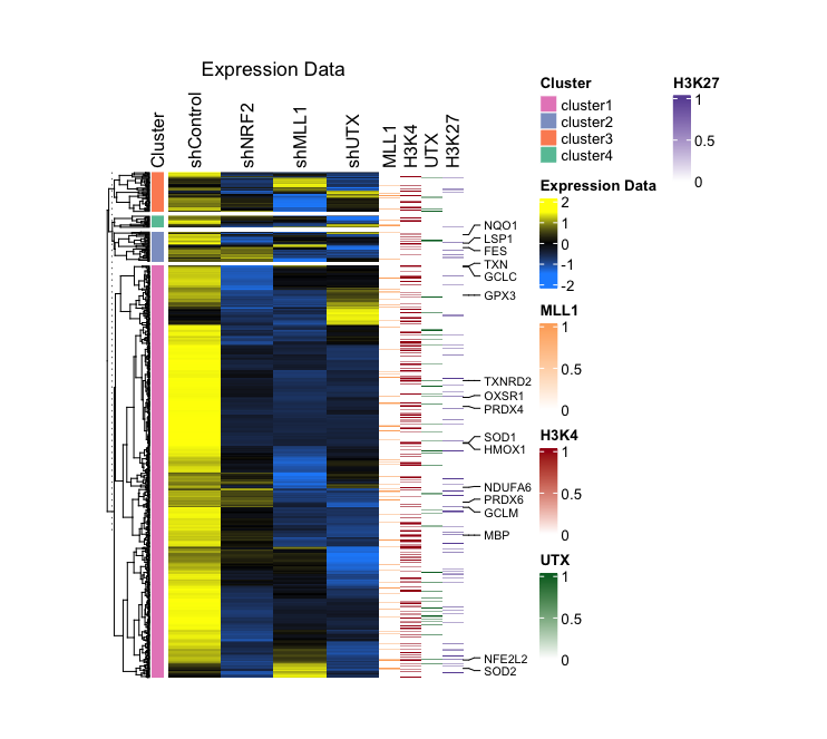
In this dataset, genes that respond to stress in human keratinocytes and three derived knockdown cell types are categorized by their fold change values, using normal cell expression levels as a baseline. Then, these genes were manually grouped into four categories (Clusterrow) based on their expression patterns. Additionally, genes associated with ROS are enumerated in a separate row (ROS.hallmark) and identified as ROS. Moreover, the presence of MLL1, H3K4me3, UTX, and H3K27me3 peaks, as detected in normal cells under stress conditions from ChIP-seq results, is indicated by 0 (NO) and 1 (Yes) values.
1. Normalize data and prepare matrix/annotation
# Load data
data <- read.csv("ROS_heatmap.csv", header = T)

# Matrix the data as main heatmap and Normalize to Z-score.
expression_data <- as.matrix(data[, 2:5])
z_score <- t(scale(t(expression_data)))
z_min <- min(z_score)
z_max <- max(z_score)

# Create the annotation dataframe and set annotation
cluster_factor <- factor(data$Cluster)
annotation <- data.frame(Cluster = cluster_factor)
rownames(annotation) <- rownames(data)
set2_palette <- brewer.pal(8, "Set2")
row_anno <- rowAnnotation(
  df = annotation,
  col = list(Cluster = setNames(c(set2_palette[4], set2_palette[3], set2_palette[2], set2_palette[1]), levels(cluster_factor))),
  annotation_name_side = "top",
  simple_anno_size = unit(3, "mm")
)
- This dataset used in this case is organized as follows:
> head(data) SYMBOL shControl shNRF2 shMLL1 shUTX Cluster ROS.hallmark MLL1 H3K4 UTX H3K27 1 HHATL 1.191316 1.473315 -3.0637972 0.1852907 cluster2 0 0 0 0 2 AHR 1.478816 1.352787 -3.0637972 0.0000000 cluster2 1 0 0 0 3 NQO1 3.706885 1.283004 0.0000000 -1.2765334 cluster2 ROS 0 1 0 0 4 SSPN 1.076450 1.185496 -0.3337084 -3.2310447 cluster2 0 0 0 0 5 G6PC1 1.386497 2.442824 -0.1576905 -0.1286908 cluster2 0 0 0 1 6 PPP6R2 4.561280 4.742004 -0.1064526 3.1118796 cluster2 0 0 0 0 - Next, matrix the dataset (ChIP-seq) that will be used as the secondary heatmap.
mll1_data <- matrix(data$MLL1, ncol=1, dimnames = list(rownames(data), "MLL1"))
h3k4_data <- matrix(data$H3K4, ncol=1, dimnames = list(rownames(data), "H3K4"))
utx_data <- matrix(data$UTX, ncol=1, dimnames = list(rownames(data), "UTX"))
h3k27_data <- matrix(data$H3K27, ncol=1, dimnames = list(rownames(data), "H3K27"))
2. Plotting
- Create color palettes for the secondary heatmap.
oranges_palette <- c("white", brewer.pal(9, "Oranges")) reds_palette <- c("white", brewer.pal(9, "Reds")) greens_palette <- c("white", brewer.pal(9, "Greens")) purples_palette <- c("white", brewer.pal(9, "Purples")) - Draw the secondary heatmap.
mll1_heatmap <- Heatmap(mll1_data, col = colorRamp2(c(0, 1), c("white", oranges_palette[5])), name = "MLL1", cluster_columns = FALSE, show_row_names = FALSE, show_column_names = TRUE, column_names_side = "top", width = unit(0.5, "cm")) h3k4_heatmap <- Heatmap(h3k4_data, col = colorRamp2(c(0, 1), c("white", reds_palette[9])), name = "H3K4", cluster_columns = FALSE, show_row_names = FALSE, show_column_names = TRUE, column_names_side = "top", width = unit(0.5, "cm")) utx_heatmap <- Heatmap(utx_data, col = colorRamp2(c(0, 1), c("white", greens_palette[9])), name = "UTX", cluster_columns = FALSE, show_row_names = FALSE, show_column_names = TRUE, column_names_side = "top", width = unit(0.5, "cm")) h3k27_heatmap <- Heatmap(h3k27_data, col = colorRamp2(c(0, 1), c("white", purples_palette[8])), name = "H3K27", cluster_columns = FALSE, show_row_names = FALSE, show_column_names = TRUE, column_names_side = "top", width = unit(0.5, "cm")) - Draw a main heatmap.
main_heatmap <- Heatmap(z_score, name = "Expression Data", col = colorRamp2(c(z_min, 0, z_max), c('dodgerblue', 'black', 'yellow')), show_row_names = TRUE, show_column_names = TRUE, column_title = "Expression Data", cluster_columns = FALSE, column_names_side = "top", split = cluster_factor, row_title = NULL, left_annotation = row_anno, width = unit(5, "cm"), height = unit(12, "cm")) - Combine the main heatmap with the secondary heatmap.
heatmap_list <- main_heatmap + mll1_heatmap + h3k4_heatmap + utx_heatmap + h3k27_heatmap

# Draw without margin
draw(heatmap_list, merge_legends = TRUE, gap = unit(0, "mm"))
3. (Optional) Showing specific gene symbols from a large list in a heatmap
If the ROS.hallmark row is marked ROS, display the corresponding value from the SYMBOL row and annotate it accordingly:
# Specify ROS markers
ros_indices <- which(data$ROS.hallmark == "ROS")

# Reflect these markers on the last heatmap among the secondary heatmaps
h3k27_heatmap_Rev <- h3k27_heatmap + rowAnnotation(
  foo = anno_mark(
    at = ros_indices,
    labels = data$SYMBOL[ros_indices],
    which = "row",
    labels_gp = gpar(fontsize = 8))
)

# Simple version
h3k27_heatmap_Rev = h3k27_heatmap + rowAnnotation(
  foo = anno_mark(
    at = ros_indices,
    labels = data$SYMBOL[ros_indices],
    which = "row")
)

# Advanced version
h3k27_heatmap_Rev <- h3k27_heatmap + rowAnnotation(
  foo = anno_mark(
    at = ros_indices,
    labels = data$SYMBOL[ros_indices],
    which = "row",
    labels_gp = gpar(fontsize = 8),
    padding = unit(0.5, "cm")
  ),
  width = unit(5.0, 'cm') + max_text_width(ros_indices, gp = gpar(fontsize = 8))
)
I typically apply these markers to the auxiliary heatmap rather than the primary one, and their inclusion is not obligatory. Please designate these markers accordingly and subsequently integrate your heatmaps:
# Combine
heatmap_final <- main_heatmap + mll1_heatmap + h3k4_heatmap + utx_heatmap + h3k27_heatmap_Rev

# Draw
draw(heatmap_final, merge_legends = TRUE, gap = unit(0, "mm"))
- Output (Left; Step 2, Right; Step 3): (Clicking on the image will open it in a larger view.)
Step-by-Step Guide: Case III - Multiple RNA-seq Combined with ChIP-seq
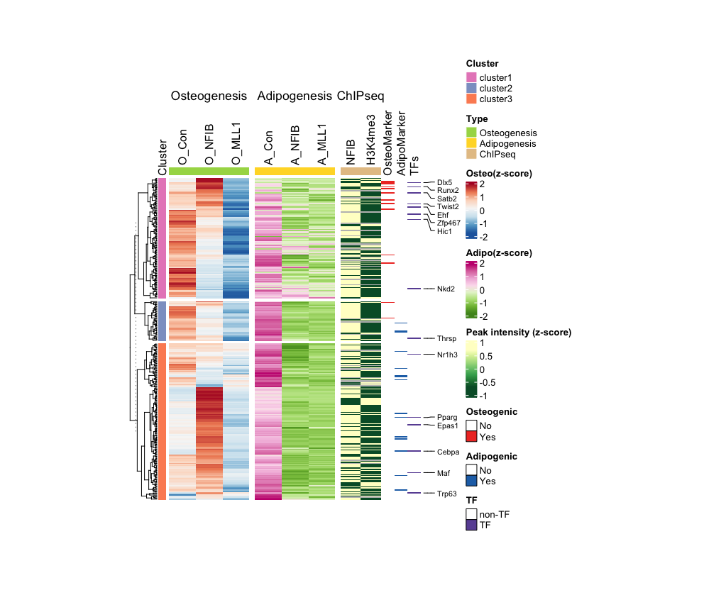
This example involves big data set derived from mouse mesenchymal stem cells (MSCs) and three different knockdown cell lines following their differentiation into osteoblasts and adipocytes, respectively. The primary data set comprises RNA-seq results from these cell lines undergone each differential stimuli. Additionally, as secondary data, ChIP-seq results are utilized for the genome-wide identification of alterations in the occupancy and enrichment of NFIB and H3K4me3 following the induction of bone differentiation in intact MSCs. Lastly, I present a heatmap to show whether the list of genes analyzed are transcription factors and regulators of each differentiation process.
1. Normalize data and prepare matrix/annotation
- Load data:
data <- read.csv("ComplexSeq.csv", header = T) - This dataset used in this case is organized as follows:
> head(data) Symbol O_Con O_NFIB O_MLL1 A_Con A_NFIB A_MLL1 NFIB H3K4me3 TF Adipo Osteo Cluster 1 1500009L16Rik 1.7141525 1.650957 -8.2522356 5.884279 -2.097777 -5.0292486 2.296628 1.787946 0 0 0 cluster2 2 A530016L24Rik 0.7738813 1.030212 -0.5199491 4.063868 -3.585915 -1.7736988 1.149132 1.370758 0 0 0 cluster3 3 Abca1 1.8617470 6.888385 0.5757785 3.776418 -2.151568 -1.5198181 2.175035 1.841612 0 0 0 cluster3 4 Abhd15 1.4146485 -0.256023 -0.3941591 3.219146 -3.508747 -3.6085345 2.350038 0.000000 0 0 0 cluster3 5 Acacb 2.4237469 2.502078 -1.0830766 2.121201 -1.460384 -0.6849265 1.762528 0.000000 0 0 0 cluster1 6 Acadm 0.7387791 6.690138 -0.1115445 1.582898 -1.675392 -1.2446482 1.935325 1.584191 0 0 0 cluster3 - Create and normalize data frames by experiment type and sample type:
# For RNA-seq RNA_data <- as.matrix(data[, 2:7]) RNA_z_score <- t(scale(t(RNA_data))) rownames(RNA_z_score) <- rownames(data) Osteo <- as.matrix(RNA_z_score[, 1:3]) Adipo <- as.matrix(RNA_z_score[, 4:6]) # For ChIP-seq ChIP_data <- as.matrix(data[, 8:9]) ChIP_z_score <- t(scale(t(ChIP_data))) rownames(ChIP_z_score) <- rownames(data) - Create annotation:
# Specifies color code and sets annotation for the row
set2_palette <- brewer.pal(8, "Set2")
cluster_factor <- factor(data$Cluster)
annotation <- data.frame(Cluster = cluster_factor)
rownames(annotation) <- rownames(data)

# Create row annotation
row_anno <- rowAnnotation(
  df = annotation,
  col = list(Cluster = setNames(c(set2_palette[4], set2_palette[3], set2_palette[2]), levels(cluster_factor))),
  annotation_name_side = "top",
  simple_anno_size = unit(3, "mm")
)
ordered_levels <- c("cluster3", "cluster2", "cluster1")
cluster_factor_ordered <- factor(cluster_factor, levels = ordered_levels)

# Create column annotation
col_osteo_anno <- HeatmapAnnotation(
  Type = factor(c("Osteogenesis", "Osteogenesis", "Osteogenesis")),
  col = list(Type = c(Osteogenesis = set2_palette[5])),
  show_annotation_name = FALSE,
  simple_anno_size = unit(3, "mm")
)

col_adipo_anno <- HeatmapAnnotation(
  Type = factor(c("Adipogenesis", "Adipogenesis", "Adipogenesis")),
  col = list(Type = c(Adipogenesis = set2_palette[6])),
  show_annotation_name = FALSE,
  simple_anno_size = unit(3, "mm")
)

col_chip_anno <- HeatmapAnnotation(
  Type = factor(c("ChIPseq", "ChIPseq")),
  col = list(Type = c(ChIPseq = set2_palette[7])),
  show_annotation_name = FALSE,
  simple_anno_size = unit(3, "mm")
)

column_split_factor <- factor(
    c("Osteogenesis", "Osteogenesis", "Osteogenesis", "Adipogenesis", "Adipogenesis", "Adipogenesis", "ChIPseq", "ChIPseq"),
    levels = c("Osteogenesis", "Adipogenesis", "ChIPseq")
)
2. Plotting
- Create color palettes and plot the main heatmaps:
# Specifies colocr pallettes osteo_color <- colorRampPalette(rev(brewer.pal(7, "RdBu"))) osteo_color_function = osteo_color(256) adipo_color <- colorRampPalette(rev(brewer.pal(8, "PiYG"))) adipo_color_function = adipo_color(256) chip_color <- colorRampPalette(rev(brewer.pal(7, "YlGn"))) chip_color_function = chip_color(256) # Osteogenic RNA-seq heatmap (as a main heatmap) osteo_heatmap <- Heatmap( Osteo, col = osteo_color_function, show_row_names = FALSE, show_column_names = TRUE, name = "Osteo(z-score)", cluster_columns = FALSE, column_names_side = "top", column_split = factor(c("Osteogenesis", "Osteogenesis", "Osteogenesis")), top_annotation = col_osteo_anno, split = cluster_factor_ordered, row_title = NULL, left_annotation = row_anno, width = unit(3, "cm"), height = unit(12, "cm"), ) # Adipogenic RNA-seq heatmap adipo_heatmap <- Heatmap( Adipo, col = adipo_color_function, show_row_names = FALSE, show_column_names = TRUE, name = "Adipo(z-score)", cluster_columns = FALSE, column_names_side = "top", column_split = factor(c("Adipogenesis", "Adipogenesis", "Adipogenesis")), top_annotation = col_adipo_anno, row_title = NULL, width = unit(3, "cm"), height = unit(12, "cm") ) # ChIP-seq heatmap chip_heatmap <- Heatmap( ChIP_z_score, col = chip_color_function, show_row_names = FALSE, show_column_names = TRUE, name = "Peak intensity (z-score)", cluster_columns = FALSE, column_names_side = "top", column_split = factor(c("ChIPseq", "ChIPseq")), top_annotation = col_chip_anno, row_title = NULL, width = unit(1.5, "cm"), height = unit(12, "cm") ) # combine and draw comb <- osteo_heatmap + adipo_heatmap + chip_heatmap draw(comb) - Crate a data frame and matrix it for the secondary heatmaps:
adipo_data <- matrix(data$Adipo, ncol=1, dimnames = list(rownames(data), "AdipoMarker")) osteo_data <- matrix(data$Osteo, ncol=1, dimnames = list(rownames(data), "OsteoMarker")) TF_data <- matrix(data$TF, ncol=1, dimnames = list(rownames(data), "TFs")) # Make sure you have NA in your data, in this example, NA is converted to '0' as shown below. TF_data[is.na(TF_data)] <- 0 - Create color palettes and plot the secondary heatmaps:
reds_palette <- c("white", brewer.pal(9, "Reds"))
blues_palette <- c("white", brewer.pal(9, "Blues"))
purples_palette <- c("white", brewer.pal(9, "Purples"))

# Osteogenic markers heatmap with box legend
osteo_marker_heatmap <- Heatmap(osteo_data,
                      col = c("white", reds_palette[7]),
                      name = "Osteogenic Factor",
                      cluster_columns = FALSE,
                      show_row_names = FALSE,
                      show_column_names = TRUE,
                      column_names_side = "top",
                      width = unit(0.5, "cm"),
                      heatmap_legend_param = list(
                          title = "Osteogenic",
                          labels = c("No", "Yes"),
                          at = c(0, 1),
                          legend_gp = gpar(fill = c("white", reds_palette[8]), col = "black", border = TRUE),
                          labels_gp = gpar(fontsize = 10),
                          border = TRUE
                      ))

# Adipogenic markers heatmap with box legend
adipo_marker_heatmap <- Heatmap(adipo_data,
                      col = c("white", blues_palette[8]),
                      name = "Adipogenic Factor",
                      cluster_columns = FALSE,
                      show_row_names = FALSE,
                      show_column_names = TRUE,
                      column_names_side = "top",
                      width = unit(0.5, "cm"),
                      heatmap_legend_param = list(
                          title = "Adipogenic",
                          labels = c("No", "Yes"),
                          at = c(0, 1),
                          legend_gp = gpar(fill = c("white", blues_palette[8]), col = "black", border = TRUE),
                          labels_gp = gpar(fontsize = 10),
                          border = TRUE
                      ))

# TF heatmap with box legend
TF_heatmap <- Heatmap(TF_data,
                      col = c("white", purples_palette[8]),
                      name = "Transcription Factor",
                      cluster_columns = FALSE,
                      show_row_names = FALSE,
                      show_column_names = TRUE,
                      column_names_side = "top",
                      width = unit(0.5, "cm"),
                      heatmap_legend_param = list(
                          title = "TF",
                          labels = c("non-TF", "TF"),
                          at = c(0, 1),
                          legend_gp = gpar(fill = c("white", purples_palette[8]), col = "black", border = TRUE),
                          labels_gp = gpar(fontsize = 10),
                          border = TRUE
                      ))

comb2 <- osteo_heatmap + adipo_heatmap + chip_heatmap + osteo_marker_heatmap + adipo_marker_heatmap + TF_heatmap
draw(comb2)
3. Showing Specific Gene Symbols in the Heatmap
Select a specific gene list and create logic to display it in the heatmap:
# Specific gene list
selected_genes <- c("Cebpa", "Dlx5", "Ehf", "Epas1", "Hic1", "Maf", "Nkd2", "Nr1h3", "Pparg", "Runx2", "Satb2", "Thrsp", "Trp63", "Twist2", "Zfp467")

# Find the specific gene among input data index
row_indices <- which(data$Symbol %in% selected_genes)

# Apply the logic on the heatmap
TF_heatmap_Rev <- TF_heatmap + rowAnnotation(
  foo = anno_mark(
    at = row_indices,
    labels = data$Symbol[row_indices],
    which = "row",
    labels_gp = gpar(fontsize = 8))
)

# Draw
comb3 <- osteo_heatmap + adipo_heatmap + chip_heatmap + osteo_marker_heatmap + adipo_marker_heatmap + TF_heatmap_Rev
draw(comb3, merge_legends = TRUE, gap = unit(0, "mm"))
Output:
